Author Archives: simonburgess

Trialling teacher peer observation to raise teacher effectiveness

Simon Burgess (University of Bristol)

Shenila Rawal (OPERA)

Eric Taylor (Harvard)


Most people can remember an inspirational teacher, someone who ignited their interest in a topic and helped them make rapid learning gains during their time together. Many people can also remember a dull turn-off teacher, demotivating them completely. The sense that teachers are very different in their professional abilities, and that teachers matter immensely for learning, has been confirmed and quantified by researchers over the last decade or so. Pupils with highly effective teachers make dramatically more progress in their studies, gain better qualifications and earn more in the labour market.

The natural follow-up question is: what policies or practices will increase teacher effectiveness, and raise skills all round? But so far, such practices have proved elusive. Strong, causal evidence of student learning gains from adjusting different aspects of teacher practices, recruitment, and contracts is thin on the ground. The situation can be summed up: clear evidence of the importance of teachers, absence of any proven school management tools to increase it.

This is the issue that we address in our paper. Teachers teach, but they also learn, and the process by which teachers improve their effectiveness is at the centre of our analysis. We made a relatively low-key intervention in the operating practices of 82 large secondary (high) schools in England, over two years. The intervention was focussed on teachers of maths and English for the two GCSE years, and covered over 28,000 students and around 1,300 teachers. With funding from the Education Endowment Foundation, we introduced a system of no-stakes teacher peer observation. The intervention was run as a randomised controlled trial – schools that volunteered to take part were randomised into ‘treatment’, the teacher peer observation, or ‘control’, business as usual. Teachers from the school visited each other’s classrooms and observed their peers teaching. Teachers doing the observing were given a structure, a set of questions, to base their observation and assessment on; this was not simply sitting at the back of a colleague’s class with a pen and pad. The idea was that the observer and the observee would later meet and talk through the session.

The peer observations were formally no-stakes: they did not affect pay, promotion, dismissal or any aspect of a teacher’s contract; in practice there may have been some “low stakes” in the form of social pressures or career concerns. Crucially, at set-up we randomised the roles in this process. That is, which teachers were to be observed and which were to do the observing was not based on rank, on experience, or on previous job performance, but simply random.

Did it work? Yes – we find statistically significant evidence that the intervention meaningfully improved student achievement in maths and English GCSEs. Students in treatment schools scored 0.076 student standard deviations higher, on average, than their counterparts in control schools. That is similar to the difference between having a teacher with five years of experience instead of a novice teacher.

While schools did fewer observations than we had suggested, most treatment schools completed at least some peer observations. Using the appropriate statistical techniques to take account of the fact that schools varied in their implementation of the programme, we estimate that the impact of the scheme on the treatment schools which took at least some part was higher still, at least 0.097. These results represent educationally and economically meaningful improvements in student learning. Given that this is a cheap intervention, this is particularly valuable.

The experiment also allowed us to identify which teachers benefited from the observations. If the effects we see are due to the (slight) additional pressure on the observed teachers to prepare more and to “perform” better, then we would expect only the students taught by observees to benefit. This seems to be the general assumption made by schools (and maybe other institutions more widely) when they undertake any job evaluations. Typically, schools (or school systems) will either outsource the evaluations to external providers, or it will become just another task for the school senior leadership team to find time for. Both these approaches imply the belief that the only gainers are those observed; for the observers, it’s just a task and does nothing for their own teaching effectiveness.

Our results emphatically reject that view. We find that the students taught by teachers doing the observing benefit as much as the students of observees (in fact, we find the observers’ students benefit more but the difference between them is not significantly different). How can this be? The most likely explanation is that they themselves learn something from watching: maybe something seemingly quite minor such as an idea for dealing with a particular situation; or perhaps something much more substantial like a different approach to teaching a topic. Taking the idea further, it is interesting to wonder why even quite a brief exposure to other teachers’ methods can be effective. It may be that despite recent trends to greater openness, teaching is still to a degree a “closed door” profession in which the actual doing of the job is done for the most part with no other adults present.

Of course, to some degree, most schools do some lesson evaluations, particularly for apprentice teachers. But we think our intervention has some key elements that distinguished it from the “business as usual” procedures in control schools. These are: the observation process has a clear and strong structure to guide the observer; the observation is explicitly about “continuous improvement” not about judging for pay or progression; the observation is done by peers, not by management nor by outsiders; and the observations are reasonably frequent, not just once every few years. While clearly more work needs to be done to validate or amend the key parameters, we feel that peer observation is a very promising addition to schools’ management of their teachers in pursuit of greater student achievement.


What happens when you deregulate the teacher labour market?

Simon Burgess (University of Bristol)
Ellen Greaves (University of Bristol)
Richard Murphy (University of Texas at Austin)

What happens when you deregulate the teacher labour market? Following a dramatic policy change in England, we get a chance to find out.  In September 2013 the Coalition Government ended the use of ‘annual progression’ pay scales in all schools in England and required (not just ‘permitted’) all 20,000 plus state-funded schools to introduce their own Performance Related Pay (PRP) scheme. In doing so, the reform completely changed the basis for setting pay, affecting the whole labour market of close to half a million teachers in the public sector. Our discussion of the details of the reform and schools’ initial responses is here. And despite the scale of the changes to pay regulations, there were no changes to the way schools were financed, which allows us to isolate the impact of pay rigidities.

So, when schools can set pay as they want, within a budget constraint, what do they do? Specifically, we use this reform to address three key questions: first, how do schools change pay when given the freedom to do so? Second, how do these decisions affect the number of teachers employed? Finally, and possibly most importantly, does the decentralization of pay affect pupil performance? Details of our answers are in our just-out report, and we summarise them here.

First, it isn’t straightforward to answer these issues; we can’t just compare before and after because this was a time when many other potentially relevant things were happening, not least a slew of other education reforms, as well as standard year-to-year changes in practice and procedures. To be able to identify the effect we have to look for a factor that might provoke differential responses. We use the fact that the old teacher pay scales did not really take into account variation in local wages across labour markets (just variations in London). So we would expect schools situated in competitive high wage areas to react differently to the reform than schools in low wage areas. The sign and magnitude of these differences informs us about the extent to which the old pay scales took schools away from their desired levels of pay and teacher employment.

We have data on all the teachers in state schools in England, over all the years since 2010. Using that, we create for each individual teacher the counterfactual expected pay growth, estimating what they would have earned under the old scale point system. This is a neat way of taking into account the demographic composition of each school; for example, how many long-serving (and therefore expensive) teachers each school has. This allows us to consider deviations of actual pay from this expected pay growth as a result of the reform. We average these teacher level measures for each school, and this is our measure of the impact of the reform.

We are now in a position to answer our three questions.

  1. Post reform there is a general decrease in teacher pay growth coinciding with central budget cut-backs. But within that overall average decrease, there were systematic and substantial differences. Schools used their new flexibility to respond to local market conditions. Specifically, teachers’ salaries grew relatively faster in high wage labour markets. For example, primary schools at the 75th rather than the 25th percentile of local wage distribution increase teacher salaries by an additional 0.43 percent points (£120) annually. This is exactly as you would expect, and allowed school salaries in high-wage labour markets to start becoming more competitive.
  2. Freed from the constraints of the pay scales, some schools were able to offer relatively higher salaries and become more attractive as a place to work. Such schools were therefore able to expand employment relatively more than those in low-wage areas; in other words, the actions of these schools were successful in attracting and retaining more teachers. (Note that we keep saying “relatively more”, because that is what we are talking about here – the differential effect of the reform in high- and low-wage areas; the overall absolute changes in wages and employment over this period were also affected by other factors, notably the central schools budget). Interestingly, we find no (relative) increase in the number of newly hired teachers, meaning that the increase in employment occurred through a reduction in the outflow of teachers: schools used their funds to retain their existing teachers.
  3. Our third finding is that schools in high-wage labour markets achieve relatively higher growth in student test scores. The gains in student test scores are larger in schools with more disadvantaged student populations. Moreover, as the majority of the test score gains occurred during the first year of the reform before pay or the quantity of teachers employed were able to change, implying that much of these initial gains are due to response from the incumbent teachers. For each pound that local average hourly wages are higher, primary schools post-reform experience a 1.4 percent of a standard deviation increase in student test scores; secondary schools in high-wage areas see a larger increase of 3.3 percent of a standard deviation.

Of course, there are benefits to having a defined pay scales, such as greater clarity and certainty on pay for teachers, and a clear way of minimizing favouritism or discrimination in pay. (Indeed, post-reform we did find a small relative increase in male teachers’ pay that is hard to interpret). But our research shows that there are also significant and substantial benefits to removing central pay scales. National pay scales prevent local managers from allocating resources efficiently. Given autonomy, schools in high wage areas depart from the salaries determined by the national pay scales in order to increase pay and pay dispersion. This has allowed them to retain experienced staff. Perhaps most importantly, we find evidence that productivity, measured by relative growth in pupil test score gains, improves once schools have more autonomy on pay.

A simple reform to make the school choice process in England fairer

Last week, on National Offer Day, families discovered which secondary school their child will be attending. There is one stark difference in the school choice process across areas in England: the number of school choices that parents are permitted to make. Many cities allow up to six choices, but there are cities that allow only three. We argue for reform to give all parents the same number of choices and therefore potential access to the “best” school for their child.

For many, the process leading up to National Offer Day has been complex – parents spend time reviewing their options, they fill in the preferences form online and then wait for the outcome several months later. The school offer to each family is determined by an algorithm that takes into account all choices by parents in their Local Authority, the number of places available at each school and school admissions criteria. There are good points and bad points about this system, and we have been among those calling for reforms.

But at the heart of this process is a very simple and stark unfairness: in some places, families can list six schools as their preferred choices, in other places, families can only list three. This matters a lot because only having three choices to make restricts parents’ options

The evidence suggests that giving parents the opportunity to make more choices of secondary school is likely to be beneficial. With more choice slots available, parents can make more ambitious first choices, nominating their truly preferred school(s). In places where fewer choices are allowed, parents may have an incentive to nominate “safety” schools instead i.e. ones where their child has a very high chance of being admitted.

We estimate that roughly a third of households in areas with a maximum of three school choices might be constrained in their choices. This is significantly higher in some areas (for example in Bristol, Liverpool and Middlesbrough, over half of parents use up all the choice slots they have). This will have an effect on the allocation of pupils to schools. It is likely to encourage parents to play “safe” and nominate their local school in which they stand a good chance of getting in. This works to preserve the neighbourhood segregation which school choice has the potential to alleviate. It also means that those “play it safe” schools have more of a captive audience and less pressure to raise their game.

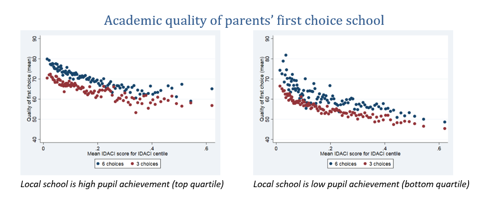
Having more choice slots available allows parents to be more ambitious with their top choices and still play safe with the lower choices. We can illustrate this point using data on parents’ secondary school choices in England from the 2014/5 cohort. The Figures show the average pupil achievement of first choice schools in Local Authorities (LAs) with six choices and in LAs with three, across the range of neighbourhood poverty. To account for differences in the choices available to parents (for example, London allows six choices, and of course also has high-performing schools), we draw the graph separately for parents whose local school is of high pupil achievement, and for those where it is of low pupil achievement.

This difference is evident in all areas, including areas with high levels of neighbourhood poverty and whatever the academic performance of the local school. This suggests that allowing more choices would improve the outcomes for parents. This is likely to lead to more pupils being assigned to a school of their choice, rather than their “safe” school. Our evidence clearly shows that first choices are more ambitious in terms of a measure of school pupil achievement in LAs where parents can make six choices rather than just three.

The thought experiment for this proposal is as follows: imagine an LA with three choices available that increases to allowing six choices. Parents respond by making more ambitious choices in their top choice slots. At the date of the policy change, the number of places in high-performing schools, low-performing and so on are all fixed; the issue is about allocation, which pupil ends up at which school. We conjecture that the impact on school attended is likely to be greater for pupils from poorer neighbourhoods. For more affluent pupils, there may not be much further gain available; but for poorer families, a more ambitious first choice might bring them into consideration for substantially higher performing schools.

What are the costs of this reform? The websites that are dedicated to school admissions would have to be updated to include more school choices if the permitted number was increased to six. For most websites, the only cost would be once-off and minimal. There are some aspects of the school choice process that are still paper-based (for example supplementary information forms), which would cost more with more choices made, but this is not a significant component of overall costs. The cost for parents should also be small: some additional time might be taken to complete the application process. There would arguably be more time taken to research schools, but this research may have been conducted anyway, before selecting three choices rather than four or more. In any case, parents are not forced to make the maximum number of choices.For LAs, if increasing the number of choices led to an increase in the number of cross-LA school choices, this may increase the co-ordination required between LAs.

Overall, we see this as a very simple reform to improve the fairness of the school admissions process that has important benefits and small costs. Having only three choices, or even six, is low compared to elsewhere in the world: for example, Spain allows eight choices and New York City allows twelve choices. We propose that Local Authorities (LAs) be encouraged or required to increase the permitted number of school choices that parents can make.

Simon Burgess, Estelle Cantillon, Ellen Greaves, Anna Vignoles

How fair is the education system in England?


The evidence shows that access to high-performing schools in England is unfair. The system prioritises pupils whose families can afford to live near enough to those schools to be admitted. The evidence that I and others have accumulated on this over the last five years suggests we need to try a different way of deciding which pupils get into the most popular schools. We have written about this here, here  and here. For some years I have proposed a ‘marginal lottery’ – reserving some places at each school for pupils further away from the school, see here and here.

While the education system in England is unfair, it is worth asking how it compares to other similar countries. The latest PISA report, released a week ago, focuses on Equity in Education: whether an education system provides in their words “equal learning opportunities to all students”. The responses to the report from England that I have seen have been few, and typically negative. Commentators have focussed on low levels of emotional wellbeing in England relative to other countries: for example here, here and here. This is undoubtedly important.

The core issue of the report is equity in education. The results are central to the report, in the first table in fact, Table 1.1. How should we judge the equity of an education system? Not the equity of a country as a whole, but specifically the education system. One way is to gauge the extent to which your family background determines your educational outcome. If background is everything and there is very little chance to do well if you start out poor, then we would say equity is very low. If background matters little and anyone can excel, then equity is high.

PISA has data on the cognitive achievement of fifteen year-olds around the world. It has a lot of data on family background which it uses to create a composite measure of each student’s socio-economic status, what PISA calls an index of economic, social and cultural status.

Then it’s easy – create a statistical measure of how important variation in family background is in explaining variation in cognitive achievement? High values imply low equity (“background explains a lot”), low values imply high equity (“background is only one factor”). While obviously other definitions are available, in principle this seems to capture the heart of the question of equity – how important is your background in determining your outcome?

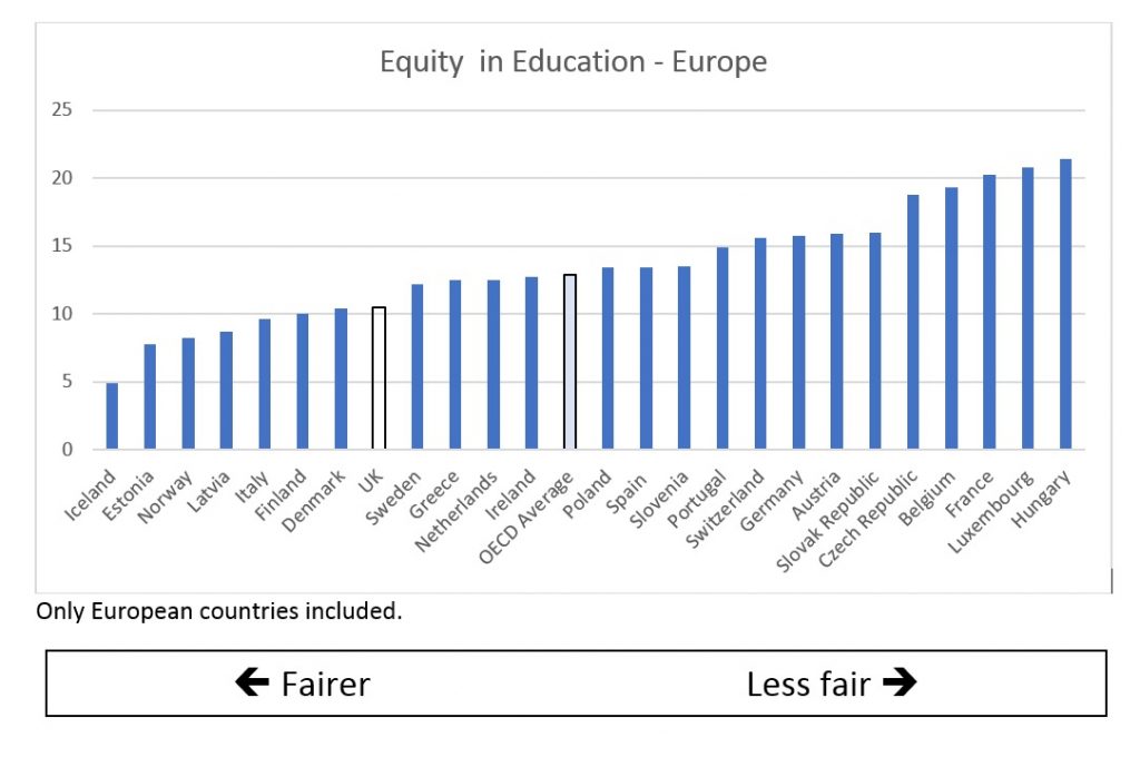
How does the UK do? Really well, in fact. Our education system is significantly better than the OECD average: significantly fairer than the typical OECD country. In our system, your background explains significantly less of your cognitive achievement than it does across the developed countries of the world. Among European countries, Denmark, Estonia, Finland, Iceland, Italy, Latvia and Norway beat us; significantly worse than the UK at equity in education are 17 other European countries.

I have plotted results for the European countries below (source: OECD (2018) Equity in Education. OECD. Figure 1.1, p. 27):

pisa2


Picking out a few of these: the less equitable list includes France (among the least equitable of all OECD systems), Switzerland, Germany, and the Netherlands.

Some of these should not be a surprise. Those of us who are against selection in schools (and that’s most of us, right?) believe it increases inequality and reduces social mobility. It should not be surprising when systems with early selection – like Germany – have much lower equity. Further results in the report (also in Table 1.1) show that the equity measure in the UK hasn’t changed much from the last PISA Science-focussed programme in 2006. The implication of that is that the UK would have stood out even more strongly in 2006 as fairer than most, and therefore that the policies that have generated this outcome were already in place in the early 2000s.

Why is this, what causes these differences? Clearly, we cannot ascribe a single cause to this system-level outcome, and no doubt someone is doing the proper analysis right now. My own speculations would include some of the progressive policies worth defending in the school system in England: very little grammar school selection; no tight rules on simple “go to your local school”; strong school accountability rules (that have the greatest effect on schools serving low income neighbourhoods); and strongly unbalanced school funding giving more support to the more disadvantaged schools.

Now of course:

  • the fact that other countries have more unfair school systems does not negate the fact I started with, that the education system in the UK is unfair and urgently needs reforming;
  • this measure is taken at age 15 and it may be that things go much more inequitable in UK compared to other countries after age 15; something explains the low social mobility performance of the UK, though that may be more in the labour market than in education;
  • this simple measure is very useful, but more detail is useful also, other measures of family background for example;
  • and there are indeed some very poor outcomes for the UK in the report, low emotional resilience as noted and the adult skills scores.

Nevertheless, we and other countries can learn something from this international perspective on our education system. The absence of grammar schools, strong school accountability and differential pupil funding may have played their role in generating a fairer education system here than in many of our neighbours in Europe.


School choice and school admissions

Simon Burgess, Ellen Greaves, Anna Vignoles

Each year around 600,000 children in England need to be assigned to one of roughly 600,000 school places. That’s a huge and complex task – how should we set about it, and with what aim? Different countries deal with it in different ways, but one of the common approaches is simply to ask parents which school they’d like their child to go to. Places at oversubscribed schools are then allocated to children on the basis of published admission criteria. This choice-based system is in place in England.

It’s fair to say that this approach is not universally popular. Some see it as a bit of a sham, with little real choice available. Others see it largely as just another source of stress for parents and children, giving very little reward for investing time in it. And others see it as unfair, a mechanism for perpetuating educational inequality and increasing social segregation. One thing is clear though, which school you go to does matter: educational attainment is key to a child’s life chances, and schools vary in their ability to deliver this.

For the first time, we have access to data on all the school choices made by all the parents in England seeking a place for their child in a state secondary school. This treasure trove of data is also matched to information about the pupils making the choices, and to the schools being chosen. Fully analysing all this data will keep us busy for years. But already results are emerging to challenge some of the criticisms made of the choice-based system.

First, it’s not all just a sham. A large proportion of parents use the school choice system pro-actively to achieve a preferred school. They make many choices, they look around, and they focus on school academic quality. We find that 65% of parents make more than one choice, and 27% make all the choices they can. Perhaps surprisingly, the maximum number of choices available varies around the country, generally three or six, the higher number available in London and some other urban areas. In Southwark for example, 31% of parents make all six choices; in rural areas such as Northumberland only 20% make more than one choice.  Most parents also do look beyond their local school. Perhaps contrary to expectations, only 39% of parents put their nearest school as top choice; in fact, only 55% put their nearest school as any choice.  This strongly suggests a pro-active approach, not simply writing down the default.  Furthermore, this activity of bypassing the local school is more common when the local school is of lower academic quality. On average, when households nominate a first-choice school that is not their nearest, their first-choice school has 20% higher attainment than the nearest.

Second, fully engaging with the school choice process does pay off. Parents who make more choices tend to end up with an offer from a higher performing school. Those making six choices and securing their first choice of school receive an offer from a higher performing school than those making just one choice, even if the latter do indeed get that one and only choice. For example, comparing those who are offered a place at their first-choice school, the percentage of pupils in the school achieving 5 A*-C is 62% for those who make one choice compared to 68% for those who make six choices. This may be because making more choices allows the household to be more “ambitious” with their top choices – choosing high performing schools where admission is not guaranteed. Indeed, those who make more choices are also offered higher performing schools even if they end up being allocated to one of their lower ranked school choices (for example their second or third choices). Finally, it is important to make the point that it is not just affluent families that invest the time to research and choose schools. Families eligible for free school meals, on average, make as many choices as richer families, are as (un)likely to choose the local school and also take account of school quality.

School choice is not a sham, and it does reward careful operation. However, we share the critique of the system that it is does not work as well for poorer families. But the key point is this – the inequality comes not in the process of choice per se. It comes in the other half of the system, in the way that places are allocated in very popular, over-subscribed schools. We have a system in which whoever can afford to live near to the good school gets in. This criterion is not the only way to allocate pupils to schools and we have written before about alternatives that do not link a child’s chance of getting into popular schools to her parents’ income. This is what needs to be reformed, rather than abandoning the idea of choice altogether.


Teacher pay – what has been the response to the introduction of performance-related pay?

Simon Burgess (University of Bristol)

Ellen Greaves (University of Bristol)

Richard Murphy (University of Texas at Austin)


Teacher recruitment and retention are at the forefront of education policy discussion at the moment. The pay of teachers is often cited as a problem, and possibly part of a solution. Clearly the level of pay is an issue, with the continuing overall pay cap implying real terms pay cuts for many teachers. But another part of the picture is the procedures which decide how much an individual teacher gets paid, and until recently this has been the pervasive public-sector approach of pay increasing (slowly) with time in post. What if we changed that and made the profession more attractive to high performers?

We have just investigated a very significant attempt to do precisely that.

Back in 2013 the Coalition Government introduced one of the most wide-ranging reforms to teachers’ pay setting in many years. The most striking element was the requirement for all Local Authority (LA) maintained schools to introduce Performance-Related Pay (PRP) for all teachers. Part of the Government’s thinking behind this was indeed to attract more high performers to the profession. Of course, PRP can have other effects on pay and performance, potentially positive or potentially negative. Note that this was a requirement for schools, not an opportunity: schools were forced to tie the pay of their teachers to performance. Furthermore, that command deliberately came without a centrally mandated set-up (some very general advice only). Schools were explicitly left to design their own pay schemes and choose their own performance measures, though many adopted union or LA recommended templates. The other main element of the reform removed the requirement for ‘pay portability’ which had guaranteed teachers at least the same pay in an equivalent new job as the old. This meant that teachers quitting one job for another could now in principle be paid less in the new one.

Our new report provides the first in-depth analysis of the impact of this major reform. We have focussed on what has to be the first question – the impact of the reform on pay. Quantifying any effect on pupil attainment will come later.

In this blog we report on our work using the School Workforce Census (SWC) to directly quantify the impact on pay.  The bulk of the report sets out the findings from consultations with teachers (900 Headteachers and 1020 teachers) carried out by the National Foundation for Educational Research (NFER).  These explored teachers’ views on implementation of the reforms (the degree of implementation, the performance management system, perceived fairness and so on). The research was commissioned by the Department for Education (DfE), and they have published the research.

Clearly it is the level of pay that matters most to many of the players in this market, not least teachers themselves, and that is discussed in the report, but it is not our primary focus in this blog.

Our concern is with the early effects of this major deregulation of the teacher labour market.

What would you expect to see? We know teachers’ performance differs dramatically, and so any reasonable measure of performance coupled with even a moderately-geared incentive scheme should yield substantially higher variation in pay.

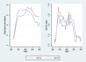
However, the data show that while there is greater variation in pay, the increase is small. This graph shows the variation in base pay for teachers for a time period before the reforms (November 2012) and a time period after the reforms (November 2015).

prp fig

The left-hand panel uses the standard deviation as a measure of variation, and the right hand panel shows a measure that is less sensitive to outliers in pay. Happily, they both tell the same story.  A very similar pattern is also evident for the pay of school leaders (see Figure 4 on page 40 of the report). This small increase in variability is present across both main phases of education, all school types and all the teacher characteristics we had, including whether they were teaching a shortage or non-shortage subject. We emphasise that this is the straightforward ‘raw’ variation, we have not taken account of teacher characteristics and changes in the composition of the teacher workforce over these years. However, the fact that the small increases in variation appear to be common suggests that a conditional analysis would show the same thing. A final finding is that the increases in within-school and between-school variation are about the same. This is consistent with schools implementing different PRP policies, with differences in the scope to differentiate pay.

The first place we might see some signs of change is in the distribution of annual pay changes for teachers. Again the story is of some slow change.  First, many schools continued to award annual pay increases that closely mimicked the old spine points. For them, the requirement to differentiate pay by performance does not appear to be something they wanted to embrace, and it seems that they simply did the least they could to comply with the directive. Nevertheless, there is a significant decrease in schools paying the modal pay rises.


Percentage of teachers on the main pay range but below the top of the pay range whose annual change in nominal pay (full-time equivalent base pay) is in one of three modal groups.

2010-2011 2011- 2012 2012- 2013 2013- 2014 2014- 2015
75.1 76.1 67.6 49.3 39.8

(for details, see Table 8 in the report.

In summary, after two years of a mandatory policy to base pay on performance rather than tenure, some schools are starting gingerly to use their new freedoms. Not all schools, and those that do, not by much. Since the impact on pay and incentives has been minimal, we would expect little early impact on recruitment and retention.

How can this be? In the survey, 99% of Headteachers from LA maintained schools reported that they had implemented the reforms (as they were required to do). What this suggests is that for many schools that implementation was largely symbolic. Actual pay awards varied little and supposed links to performance were minimal. Given that no performance management system was imposed on schools, they were clearly free to pick metrics that did not discriminate much between the performance of different teachers.

One key question is: why did so many schools decide that introducing stronger PRP would be unwise? Perhaps it’s not so unexpected: economic theory suggests a number of reasons why a straightforward private sector logic for PRP might not translate into the public sector and teachers in particular. These reasons include hard-to-measure productivity, outputs produced by teams of people (for example, the Maths Department), the risk of dysfunctional outcomes (for example, so-called ‘teaching to the test’), as well as a concern about union and teacher dislike of PRP. Finally, PRP was introduced at a time when many schools were facing a tight financial situation, limiting scope for increasing teacher pay. Would it have been different if it had been introduced in a time of growing school budgets?

It’s too early to see how the system might evolve. As with any major change, meaningful implementation is likely to be slow, even for something schools are required to do! The early indications of a move away from spine points may continue and the shadow spine points might gradually disappear.

Of course, the true test of the policy will be whether there is an impact on pupil attainment from the incentives. We plan to look at this in the near future. While the international evidence is split, there is certainly reason to think it might appear. But the key point is this: a lot of evidence shows that people respond very precisely to what they are incentivised to do. The exact performance metrics that schools have chosen are therefore key to the success of this policy and are largely unknown: design is key. The quixotic decision to allow schools to pick their own may yet come back to haunt the government.


(Mis-)understanding school segregation in England? Comments on a new measure of segregation

Simon Burgess and Rich Harris


A new measure of segregation has been proposed by the iCoCo Foundation, School Dash, and The Challenge, which is a charity for building a more integrated society. It appears in the report, Understanding School Segregation in England, 2011-16, where the method, details of which can be found here, has been used to look at ethnic and social segregation between schools in England. The report states,

Across all schools in 2016, 26% of primary schools and 40.6% of secondary schools were found to be ethnically segregated or potentially contributing to segregation by our measure; while 29.6% of primary schools and 27.6% of secondary schools were found to be segregated by socio-economic status, using FSM-eligibility as a proxy (p.13 of The Challenge’s report, emphasis added)

And the first of six recommendations is:

As part of its response to the Casey Review [Casey 2016], the Government should recognise the trends that Casey, ourselves and many others have identified and set a clear direction to reduce the growth of school segregation and to reduce segregation wherever it is at a high level and encourage all agencies to act accordingly, providing advice, support, guidance and resources as appropriate (p.17, emphasis added)

Whilst few would argue against reducing segregation, the assertion that it is growing is contentious. There have been a number of claims that segregation is increasing (for example here). However, the very clear consensus is that ethnic residential segregation fell between the 2001 and 2011 population censuses in England. In regard to ethnic segregation between schools, one of us has shown that the overall trend is downwards (see Burgess here). This difference in conclusion raises two important issues: what do we mean by segregation, and how does this ‘new measure’ difference from more established approaches, potentially affecting its results?

Let’s begin with segregation. It’s an emotive word that conjures up pejorative meaning in the press and in public debate so it has to be used with care and clarity. The widespread academic meaning is simply one of looking to see whether the places where one ethnic group is more likely to be found are also the places where another group is not: to say “segregation is high” is to describe a situation where ethnic groups are spread very unevenly between different schools and largely in different schools from one another. The standard measure of segregation quantifies this unevenness but offers no insight on how it occurs. Segregation is typically conceived as the net outcome of a number of often inter-connected processes, embodying the decisions of different people and institutions, and of the structural constraints upon them such as the operations of the housing and labour markets.

The data and interest to measure segregation grew up in the 1950s, particularly initially in the US with a focus on black-white segregation within cities. Standardised ways of measuring were developed, indices were compared, and their statistical and technical properties established. The most commonly used measure is the Index of Dissimilarity (D index), which measures the extent to which the composition of individual units (such as schools, neighbourhoods or city blocks) differ across a study region. It captures the key part of the definition of segregation, namely separation: it measures the extent to which different groups are found apart in separate housing, separate schools, or separate jobs. This is a tried and trusted measure, with well-understood properties and with a huge back catalogue of comparable results. It can also be decomposed; for example, to gauge the contribution of different types of school to the overall value or even to assess scale effects (is segregation happening at the micro-, meso- or macro-scales?). This is the measure both of us have used to understand patterns of ethnic segregation in England’s schools, including analysis of the levels and trends in ethnic segregation (for example Burgess and Wilson, 2005; Harris, 2017).

So questions arise: why a new measure? What is the added value in basing a measure on a comparison of the school with its local neighbourhood? How does it relate to the Dissimilarity Index, and does it tell us anything new about segregation?

What the new measure tries to capture is the difference between schools and their neighbourhoods on the basis that the ethnic composition of a school ‘ought’ to reflect that of its surrounding neighbourhoods if admissions into that school are geographically determined and unbiased against race, social class, prior attainment, and so forth. This is not the first time that the differences between schools and neighbourhood have been measured (see Burgess et al, 2005; Johnston et al 2006) and the Casey Review makes much of the fact that, “the school age population is even more segregated when compared to residential patterns of living” (p.11) [but that’s most likely a demographic effect and not evidence that the segregation is increasing: see Harris, 2017]. However, rather than looking at the ethnic composition of neighbourhoods directly the measure actually takes a proxy for the ‘local area’ by averaging the characteristics of the nearest 10 other schools to the one under consideration. The assumption is that any school’s intake should be the same as the average of its 10 nearest neighbours.

We will return to that assumption presently. Before doing so we note that this is not a measurement of segregation as widely understood because it no longer considers segregation as an overall outcome. Instead, it is a partial look at the differences between where people live and where they go to school; differences perhaps due to the ways that the school admissions system works but perhaps also due to the school choices people make.

The difference in what is meant by segregation is easy to see with an example. Imagine a city with two ethnic groups who largely live in different zones of the city (residential segregation is very high). There are ten schools in each of the two zones of the city – each zone is entirely mono-ethnic and so are its ten schools. The standard D index would say that school segregation in this city is very high. Half the schools have 100% pupils from one group and the other half have 100% from the other group, so this is maximum separation, maximum segregation. The new measure, however, would say that there was low or zero segregation, with most or all schools having the same ethnic composition as their neighbours and their local area. It seems to us that the standard measure would fit better with how many people would describe the city. It would be peculiar to claim that a very divided city, with very divided neighbourhoods and therefore very divided schools is experiencing no segregation!

What the new measure really means is that there is no additional segregation, once neighbourhood sorting has been taken into consideration. That is an interesting point-of-view, especially if we change the example and imagine two very ethnically mixed zones of a city, within which one particular school nevertheless obtains a very mono-ethnic intake. Such a circumstance would raise questions about the processes of school choice or of admission that led to a locally uneven outcome. However, there are problems with this approach. First, it implies that segregation caused by the school admission process can be measured independent of (having controlled for) segregation from neighbourhood sorting. In practise the two are interrelated: think of the way house prices increase around the most sought after schools. Second, as we have noted, the authors actually measure the ‘local area’ by averaging the characteristics of each school’s 10 nearest neighbours.

The choice of 10 seems very arbitrary and will mean different things in different areas – notably areas of high population density versus those that are sparse. More specifically, it is hard to understand why the best choice is 10 schools for both primary and secondary sectors when there are about 7 times more primary schools than secondary schools. The nature of bunching of schools in urban spaces is likely to mean that some schools are used in a large number of these comparisons; conceivably a single school might be in the “nearest 10 schools” for all the schools in an urban LA. This gives that school a lot of statistical ‘leverage’. If such schools are also unusual in their composition (which an urban centre school might be), then this makes the measure very dependent on those few high-leverage schools. It’s also not necessarily the case that the 10 nearest (by straight line distance) are also the 10 most easily reached. The measure ignores any natural or human made barriers that would prevent the one school recruiting from the same admission spaces as the other ten. It also does not weight for distance, since it is reasonable to suppose that the first closest school should be the most similar and the tenth nearest the least. In fact, the general approach of identifying local comparison groups for schools is not new and other more sophisticated approaches have been used, for example modelling the de facto catchment areas of schools and where they appear to be ‘competing’ or defining the admission spaces of schools in some way to compare school intakes with the composition of neighbourhoods (Harris, 2011, and for a relevant critique of the approach:  Watts, 2013; Harris et al., 2013).

The nature of the measure means that there are a number of specific decisions made in its construction that are questionable and will have significant impacts on its results. Why is segregation defined by a ratio split and an absolute point split? Why is the ratio “half or double”, and are the results of the study robust to other plausible values?  Why is the absolute point split set to 15 percentage points, and again, does it matter?

Two specific issues are highlighted in the report: the role of faith schools and trends in the data. On the former it is well known that faith schools, because they tend to recruit over larger areas (with admission policies that are less geographically determined), because there can be an element of selection (by religious practise) and because different types of faith school can appeal differently to different ethnic groups so they can have intakes that differentiate them from other surrounding schools, sometimes appearing more socially privileged. The role of faith schools and their admission policies is an area of on-going debate (the Prime Minister has recently suggested that the limit on the number of children a school can recruit on a faith criterion will be removed). However, faith schools are a heterogenous group – as a category it masks diversity.

With consideration to the overall trend in school segregation, ethnic segregation in schools is falling overall using the traditional measures. While there are undoubtedly some places for which it is increasing, that can happen when ‘minority’ groups are, on average, younger than the White British and so there are more children or particular ethnicities in particular places. In fact, while not actually mentioned in the report, and standing against some of the slightly alarmist discussion, even on this new measure, the overall trend in school segregation is down. On p. 13, the report states that “For secondary schools, 64 areas saw an increase in the number of segregated schools, whereas 74 saw a decrease (with 12 seeing no change).”  So there was an increase in 43% of areas on this new measure, some of which may be large and some of which may be small.

In summary, local measures and comparisons have a role and are useful. But they do not measure ‘segregation’ as it is usually understood and they are not unproblematic. The authors say that the new measure is “fairer and more accurate”: we would dispute this.

Two final points on an implicit link between this measure and policy ideas. First, we need to be careful about drawing attention to, and making policy based on, any exception to a general rule. We will always find places where segregation is increasing though usually only in the short term due to demographic changes. But if the overall trend is one of decreasing segregation – however measured – then that is the key result that needs to be emphasised. Second, the idea behind the new measure – comparing the composition of a school to its neighbourhood – risks implying some recommendations that might be counter-productive. Taking the base view here that schools should reflect their areas, and focussing for a moment on social segregation – segregation by eligibility for Free School Meals – the seemingly natural implication follows that we should ensure poor children go to school in poor neighbourhoods and affluent pupils go to school in affluent neighbourhoods. This is an anathema to us and is surely destined to reduce social mobility and reduce contact between ethnic groups.


References

Burgess, S. and Wilson, D., (2005) Ethnic segregation in England’s schools. Transactions of the Institute of British Geographers, vol 30 (1), pp. 20 – 36

Burgess, S., Wilson, D. and Lupton, R. (2005) Parallel Lives? Ethnic Segregation in Schools and Neighbourhoods. Urban Studies vol. 42 no. 7

Casey L. (2016) The Casey review: A review into opportunity and integration. London: Department for Communities and Local Government

Harris R, 2011, Measuring Segregation a Geographical Tale. Environment and Planning A, 43, 1747 – 1753

Harris R, Johnston R, Jones K, Owen D, (2013), Are indices still useful for measuring socioeconomic segregation in UK schools? A response to Watts. Environment and Planning A, 45, 2281 – 2289

Harris R, (2017), Measuring the scales of segregation: looking at the residential separation of White British and other school children in England using a multilevel index of dissimilarity. Transactions of the Institute of British Geographers, in press

Johnston R, Burgess S, Wilson D, Harris R, 2006, School and Residential Ethnic Segregation: An Analysis of Variations across England’s Local Education Authorities. Regional Studies, 40, 973 – 990

Watts M, 2013, Socioeconomic segregation in UK (secondary) schools: are index measures still useful? Environment and Planning A, 45, 1528 – 1535

 

Celebrating the GCSE Performance of the “Children of Immigrants”

Since 2005, I have shown here, here and here that pupils from ethnic minorities perform well in the crucial GCSE exams at the end of compulsory schooling. In particular, in terms of the progress they make through secondary school, some of the results are very impressive indeed. This is not due to any material advantages that these children have. Instead, the discussion is about aspirations, ambition and attitudes to school. Recently, Education Datalab have showed that in selective areas ethnic minority pupils are more likely to pass the 11+ too.

This post is a short follow-up to comments in a speech from Ofsted’s Chief Inspector, Sir Michael Wilshaw a few days ago. He said:

“And there is another successful aspect to our school system that has largely gone unnoticed. We regularly castigate ourselves – rightly – for the poor performance of white British pupils. Children of immigrants, conversely, have in recent years done remarkably well. … Our schools are remarkable escalators of opportunity. Whatever cultural tensions exist outside of school, race and religion are not treated as handicaps inside them. All children are taught equally.”

This echoes the 2014 analysis I made of London’s educational success, largely driven by the much higher fraction of “children of immigrants” in the capital (36% of pupils in London are White British, compared to 84% of pupils in the rest of the country).

Indeed, a focus on the ‘London effect’ has largely eclipsed the fantastic performance of ethnic minority pupils in the public debate.  In 2014, I said:

 “In this rush to hang on to the effects of a slightly mysterious policy [London Challenge], we are just marching past a demonstrable achievement of London. Sustaining a large, successful and reasonably integrated multi-ethnic school system containing pupils from every country in the world and speaking over 300 languages is a great thing. The role of ethnic minorities in generating London’s premium shows that London is achieving this. How many of those are there? I don’t know enough about school systems around the world to say, but I’d guess it’s probably unique.”

It is worth briefly revisiting the facts on how very well they do.

Of course, there is no data in the National Pupil Database on the immigrant status of children. However, we do have a rough approximation for this: whether English is the language spoken at home, or whether it’s another language. The latter group are said to have “English as an Additional Language”. In order to focus on progress through secondary school in a transparent way, I focus on pupils who all achieved the same level (level 4) in Keystage 2 maths tests (the same results arise if I use Keystage 2 English tests). For those who need such things, a full regression approach is adopted in the papers noted above.

First of all, simply the average performance across a range of different outcome measures of pupils with English as an Additional Language, and pupils for whom English is their first language. These gaps are strongly statistically significant, and very substantial. For example, for the headline benchmark score of percentage achieving at least 5 A*-C grades (including E & M) the gap is 50.5% to 62.9%. This is repeated across all the other measures shown.

GCSE Performance metrics:

Pupils with: Percent achieving at least 5 A*-C grades inc’g E & M Total GCSE Points GCSE grade in Maths GCSE grade in English Number of pupils
English as the First Language 50.48 339.2 4.92 4.93 227429
English as an Additional Language 62.88 358.0 5.39 5.23 24761

Only pupils with level 4 in KS2 Maths. GCSEs coded as A* = 8, A = 7, B = 6, …. U = 0.

(Note that this is data from 2013 GCSEs as that it what I have handy, but I seriously doubt anything has wildly changed).

In fact, if we look in a little more detail, the contrast is even stronger. The difference in performance between the two groups among pupils who are eligible for Free School Meals is huge, 28.5% and 55.8%. That poor pupils with English as an Additional Language score better than non-poor pupils with English as their First Language is indeed a remarkable achievement.

The percentage achieving at least 5 A*-C grades (including E & M):

  Eligible for Free school meals?   Gender
Pupils with: No Yes   Female Male
English as the First Language 53.7 28.5   60.9 39.1
English as an Additional Language 65.2 55.8   74.0 51.2


As Sir Michael Wilshaw rightly says, we urgently need to address the low GCSE attainment of poor White British pupils. But we should not let that stop us from celebrating the joint success of the “children of immigrants” and England’s education system.


Using behaviour incentives to raise GCSE attainment in poor neighbourhoods: Evidence from a large-scale field experiment

Many countries struggle with a long tail of low attainment in schools.  This blights individual lives and represents lost output for the economy as a whole. Low attainment is also typically associated with particular socio-economic backgrounds, and growing up in poor neighbourhoods, which strengthens the persistence of disadvantage.  Increasingly, governments are turning to new ideas in an attempt to deal with this problem. One of these is the potential for incentives to change behaviours in schools.

Our new study shows that these have powerful positive effects on GCSE scores for many pupils wiping out about half of the disadvantage attainment gap in secondary schools. This effect is concentrated on low-attaining pupils, with no effect on high attainers.

Why are incentives needed? There is an obvious and substantial incentive for good performance in school – studying hard will earn good qualifications, which will bring a good income, better health, longer life expectancy, and higher self-reported well-being. For students who have already internalized the inherent incentives for working hard in school, additional rewards may add little further motivation.

But there are many places where that argument can break down for some pupils. Pupils may not really know what is needed to achieve high grades; they may misunderstand the importance of effort (rather than say innate ability or parental resources); they may believe that qualifications will not help them; they may lack the facilities to study and the motivation to secure them; or they may only really care about now.  Such students may be responsive to short term incentives for effort. So it seems likely that there will be diverse responses to incentives: powerful for some, irrelevant for others who are already well motivated.

We set up a large scale field experiment involving over 10,000 pupils in 63 schools to test the impact of incentives. We recruited schools in the poorest decile of neighbourhoods in England. The experiment was funded by the Education Endowment Foundation, to whom we are very grateful.

We incentivised inputs (effort and engagement), not outputs such as test scores. These were repeated, immediate rewards incentivising effort and engagement at school. The pupils involved were in year 11, the final year of compulsory schooling leading up to the very high stakes GCSE assessments.  The incentives are based on conduct in class, working well during class, completing homework, and not skipping school. We compared a cash incentive and a non-financial reward: a high-value event determined jointly by the school and students.  The cash incentive offered up to £80 per half-term (for a total of £320 over the year).  This might sound a lot, but at the youth minimum wage some of them would be earning a few months later, it works out at less than an extra hour per week-night. All the details are in our paper.

The experiment has yielded promising new results. In fact, our paper is the first to test the use of behaviour incentives for high-stakes tests, and the first to compare financial and non-financial rewards over the timescale of an academic year.

Behaviour was incentivised in classes for GCSE Maths, English, and Science. Our hope was that improved effort and engagement would raise GCSE scores, even though the scores themselves carried no rewards. The overall impact of the incentives on achievement is low, with small, positive but statistically insignificant effects on exam performance.  However, that small effect is an average of the effect on two groups. There are pupils who “get” the inherent incentive in education, have no need of further encouragement and for whom we would expect zero effect; and there are pupils who don’t, and who might well be affected by a more immediate and obvious reward.

We use statistical techniques to identify these two groups using the rich data on pupils available in the National Pupil Database. In fact, at least half of the pupils have economically meaningful positive effects, principally but not only for the cash incentive. We find that this has very substantial and statistically significant effects in Maths and Science. In the metric researchers use to compare results across studies, the Maths GCSE score increased by 16% of a standard deviation (SD), and the Science score by 20% of an SD. Education researchers will know that these are very large effects. Another comparator is that this has equivalent effect to a very substantial improvement in teacher effectiveness (one SD).

The best way of gauging the impact of the intervention is that for this group it is more than half of the impact of poverty (eligibility for free school meals, FSM) through secondary schools . This is worth emphasising: a one-year intervention costing around £200 – £320 per student eliminates half of the FSM gap in Maths and Science GCSE scores in the poorest neighbourhoods.

Of course, to repeat, there are pupils for whom this intervention has no effect, pupils who are already putting in a huge effort at school.

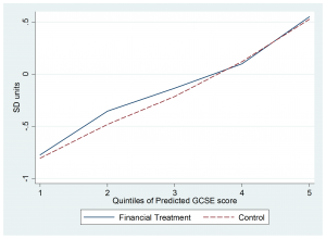
So who are these groups? The Figure below shows very clearly that the impact is on low attainers. The graph focusses on the effects of the cash incentive in Maths GCSE. Among pupils with low predicted GCSE scores, pupils in the intervention group scored substantially more than in the control group. That’s not true among pupils expected to do well, the incentive makes little difference. In this sense, this intervention is perfectly targeted: unlike other interventions the group getting the most out of it are the policy-focus low attainers, not those already doing well.

maths-t1

We also analysed the impact of the incentives on summary measures of GCSE performance, including passing the 5A*C(EM) threshold. For the low attainers, this increased significantly by around 10 percentage points, and not at all for the high attainers. This is important because of the very high earnings penalty to not reaching that benchmark, estimated at about 30% of earnings.

To summarise, we offered pupils incentives to raise their effort and engagement at school. This had very substantial effects on the Maths and Science GCSE performance of half of the pupils. This impact was high enough to wipe out half of the FSM attainment gap, and is concentrated on low attaining pupils. We ran the intervention as a randomised controlled trial for over 10,000 students in 63 schools in the poorest neighbourhoods of England. This seems to offer some very promising leads for schools and for policy makers. I’ll write more about that in my next post in a few days’ time.


Two points on league tables for Multi Academy Trusts


I think school performance tables play a valuable role, providing a channel for school accountability and also informing parents’ choice of school. Our research shows that their removal in Wales for a decade from 2001 significantly reduced average pupil progress and widened inequality.

So performance metrics, “league tables”, for school groups are likely to be useful too. Today, by some wildly improbable coincidence, three different studies are released providing these for Multi Academy Trusts (MATs) and other groups including Local Authorities. These come from (in alphabetical order), the DfE, EPI and the Sutton Trust; and they all contribute a lot to the debate.

These are still early days in the development of this methodology and no doubt more work will be done to refine the analysis, continuing a DfE working paper here. But if the legislation/determination/plan/desire/hope/vague preference goes ahead for all schools to join MATs, then they will become increasingly important. These initial exploratory papers are then also very important.

I want to make two quick points about the eventual form that MAT league tables might take. Both flow from the uncontroversial point that school groups are different from schools.

First, all three reports focus centrally on the average performance across the MAT: take an outcome measure and average it across all the schools in the group. There is discussion about the choice of performance metric, and the base year and so on. The central concern is a desire to not penalise MATs taking on low-performing schools. There is less discussion about the implications of there being many schools in a MAT.

But if the average is the sole focus of the performance tables then there are significant dangers. Schools (and groups) respond to what is measured. If the only thing measured is the group average then there may be a temptation for the MAT to prioritise some schools in the group at the expense of others. This might well raise the group average at the expense of one particular school. This prioritising might include channelling resources and assigning the most effective teachers. This could leave some schools and communities badly served. And crucially this would be invisible if the MAT average was all that was published.

So it seems to me imperative that MAT performance tables must also include reporting the minimum performance as well as the average. This might be the performance of the lowest performing school in the group.  And publish the max too if you wish.

(Of course, the same argument applies to the current league tables: that they focus on the average across pupils in the school (although, briefly, they didn’t)).

Second, some chains are local, others are more geographically spread. Both configurations have positives and both have problems, for discussion another day. For parents choosing schools, there is only limited value in knowing the national or regional performance of a MAT, because chances are there is only one “branch” of that MAT you can reach, and that is the key information you need. So group level MAT performance tables can only be part of the answer; if they were all that was published, parental choice would be manifestly less well informed.

For those of you still reading, the obvious answer to both points is: publish school level tables alongside MAT level tables. Indeed; and ideally they would be published in an integrated way that was both comprehensive and comprehensible. Someone must know a 14 year old web wizard with a strong aesthetic sense.

But it seems that that may not happen. Some have suggested that the White Paper implies that schools in MATs cease to exist as separate entities. In that case, performance tables at “school” level are simply not feasible. This seems a very retrograde step and strongly undermines accountability.

As the debate around setting up MAT performance tables matures, we must ensure that these do not provide inappropriate incentives to MATs, and that they support not undermine parental choice.